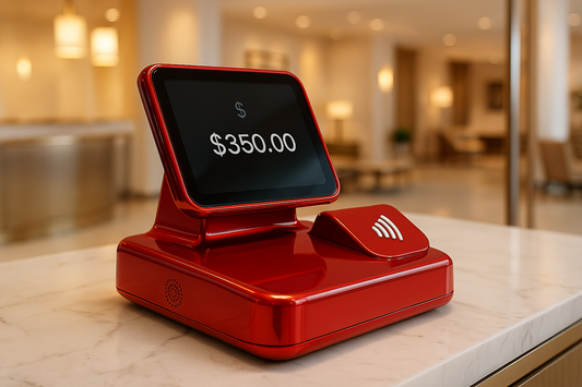
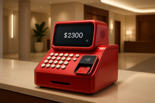
In the world of digital commerce, visual consistency plays a fundamental role in user perception and trust. Today, Mercado Pago has decided to unify its visual identity with that of Mercado Libre, adopting the same signature colors as the most famous marketplace in Mexico and Argentina. This change is not merely aesthetic, but responds to user feedback, marketing strategies, usability, and brand loyalty. Here are six key points:
1. Strengthening brand identity
Mercado Libre and Mercado Pago are two interconnected services that have grown together in the digital ecosystem. Mercado Pago is Mercado Libre's checkout. Simple enough, right? However, until recently, their visual identities were different, which could cause confusion among users. By aligning their colors, Mercado Pago reinforces its connection with Mercado Libre, consolidating itself as the platform's official payment option and strengthening its presence in the minds of online shoppers.
2. Increased user confidence
Trust is a key factor in any online transaction. Color psychology plays an essential role in brand perception. The colors chosen can evoke emotions and generate subconscious responses in users. In this case, the yellow and blue tones of Mercado Libre and Mercado Pago convey optimism, energy, and reliability. Yellow, associated with creativity and joy, captures attention and generates a sense of dynamism, while blue is linked to trust, stability, and security.
By sharing the same color palette as Mercado Libre, Mercado Pago generates a greater sense of credibility, reducing friction in the payment process and fostering a smoother and more reliable experience. Trust is a key factor in any online transaction. A brand's colors influence customers' perceptions of security and familiarity. By sharing the same color palette as Mercado Libre, Mercado Pago generates a greater sense of credibility, reducing friction in the payment process and fostering a smoother and more reliable experience.
3. Unified user experience
A consistent visual design improves navigation and usability. When a user is accustomed to Mercado Libre's colors and encounters the same identity in Mercado Pago, the transition from purchase to payment becomes more intuitive and natural. This contributes to improved user retention and reduces the abandonment rate during checkout processes.
4. Expansion and positioning strategy
Mercado Pago not only operates within Mercado Libre but is also used in physical stores and other e-commerce sites. Unifying the colors allows the service to be more easily recognized in diverse environments, facilitating its adoption by new businesses and users. This change also reinforces the idea of a comprehensive financial ecosystem, where Mercado Pago is not just a payment method, but a complete financial solutions platform.
5. Impact on unbanked users in Mexico
In Mexico, a large portion of the population still lacks access to traditional banking services, which makes it difficult to participate in e-commerce. Mercado Pago, by strengthening its visual identity with Mercado Libre, can generate greater familiarity and trust among these users, encouraging them to adopt digital payment methods.
The colors blue and yellow, associated with a well-known platform like Mercado Libre, can make unbanked users perceive Mercado Pago as a secure and accessible alternative. Furthermore, the visual integration facilitates digital education, as many consumers are already accustomed to Mercado Libre's colors and experience, lowering the barrier to entry into the digital financial ecosystem.
Mercado Pago has also implemented solutions such as cash payments in convenience stores, prepaid cards, and financing options, facilitating access to financial services for people without bank accounts. With a unified design and a clear inclusion strategy, the change of colors can play a key role in the financial digitalization of millions of Mexicans.
6. Differentiation from the competition
In a market with multiple digital payment options, visual identity can be a key differentiator. Companies like PayPal, Stripe, and Google Pay have strong and easily recognizable identities. By standardizing its image with Mercado Libre, Mercado Pago positions itself more strongly against its competitors, highlighting its relationship with one of the largest e-commerce platforms in Latin America.
The change from Mercado Pago's colors to those of Mercado Libre goes beyond a simple aesthetic decision. It's a well-thought-out strategy to reinforce brand identity, improve user trust, optimize the shopping experience, and consolidate its market position. In a digital environment where visual consistency and the perception of security are essential, this decision strengthens Mercado Pago's presence as the preferred payment option both on and off Mercado Libre.


1 comment
lo peor que pudieron hacer, ¿y porque no cambiaron el color de mercado libre a celeste?
Es una tortura a la visión. espero y deseo que seamos miles los que no estemos de acuerdo con el color y vuelvan a sus raíces.